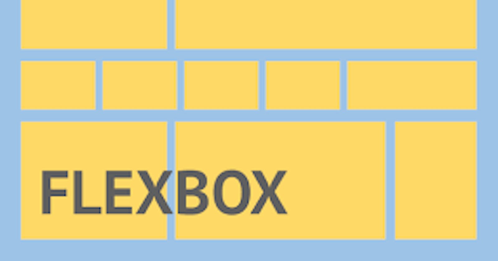


Basic concept of Flexbox
Flexbox is a layout mechanism to layout, align and distribute space among the items contained inside a flexbox in one dimension. You can align the flex items either row-wise or column-wise, depending on the flex-direction values. In this blog, we are going to learn how to make use of flexbox in css for styling.
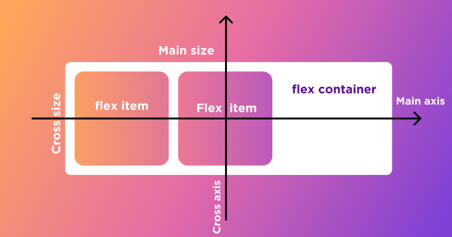
Flex axes
When elements are laid out as flex items, they are laid out along two axes:
main axis: The axis running in the direction flex items are laid out in (for example, as rows across the page, or columns down the page.)
cross axis: The cross axis is the axis running perpendicular to the direction the flex items are laid out in.
Initializing a flexbox
Flexbox consist of 2 main components i.e.
Flex container: The div with class = "container" should consist of list of elements which needs to be aligned inside a flexbox.
Flex items: the list of items present in the container class are called as flex items.
For creating the flexbox, we need to create a flex container along with setting the display property to flex.
.container{
          display: flex;
          }
flex-direction property
This property defines the direction toward which the flex-items are laid. flex-direction has 4 possible values:
- row: to align flex-items from left to right along the row.
.container{
         display: flex;
         flex-direction: row;
        }
- row-reverse: to align items right to left in a row.
.container{
         display: flex;
         flex-direction: row-reverse;
        }
- column: to align items top to bottom along a column.
.container{
         display: flex;
         flex-direction: column;
        }
- column-reverse: to align items bottom to top
.container{
         display: flex;
         flex-direction: column-reverse;
        }
Note- When we create/initialize a flexbox, by default the flex-direction is row-wise.
Flex properties for parent (flex-container)
Following are some important properties for the flex parent:
flex-wrap: This property sets weather the flex items should be forced into one line or should be wrapped into multiple lines.Values of flex-wrap property can be 'wrap' , 'nowrap' , 'wrap-reverse'.

justify-content: This property is used to align the flex-items along the main axis. Its value can be 'flex-start' , 'flex-end' , 'center' , 'space-around' , 'space-between' etc.

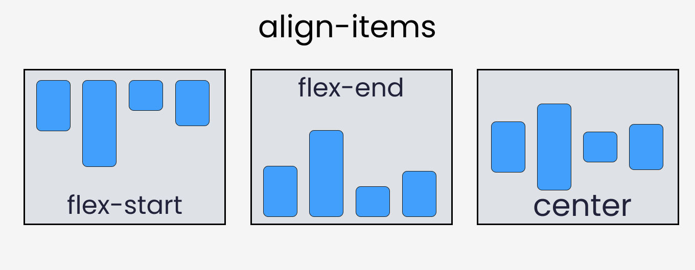
align-items: This property is used to align flex-items along the cross axis. Its value can be 'stretch' , 'flex-start' , 'flex-end' , 'center' etc.
align-content: Aligns flex container's lines when there is extra space in the cross axis.
Flex properties for the children (flex items)
Following are some important properties for the flex children:
order: It controls the order in which the items appear in the flex container. By default, all flex items have an order value of 0. Flex items with higher specified order values will appear later in the display order than items with lower order values.
align-self: Allows default alignment to be overridden for individual flex items.
flex-grow: Defines the ability for a flex item to grow.
flex-shrink: It specifies how much a flex item will shrink relative to the rest of the flex items.
Conclusion
I hope this blog gave you a brief idea about what is a 'Flexbox', its various properties and its usage.
Thank you for taking your time to read:) Stay tuned for upcoming articles on css.